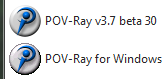
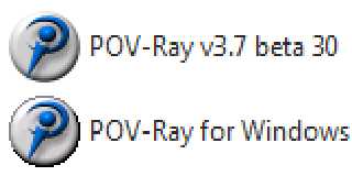
Perhaps a very minor thing but here's the ugly P-R 3.6 icon.
Maybe this has long since been ignored. Either that or I'm the only person
seeing this. Anyway, posting this because I think there needs to be a
changed icon when 3.7 is finalized since there could be confusion about
which is which if both are installed.
Leaving this ugly 3.6 icon as-is helps me know which to click on but maybe
it shouldn't have the gray and black jaggy encircling it, should it...? I
never paid much attention to it until all my other icons were getting clean
appearances.
Note that this is more about the old 3.6 icon, not the beta... well, maybe
it is about the similarity of the two also.
Thanks for looking.
Bob
Post a reply to this message
Attachments:
Download 'pr36-7icons_sm.png' (6 KB)
Preview of image 'pr36-7icons_sm.png'
|